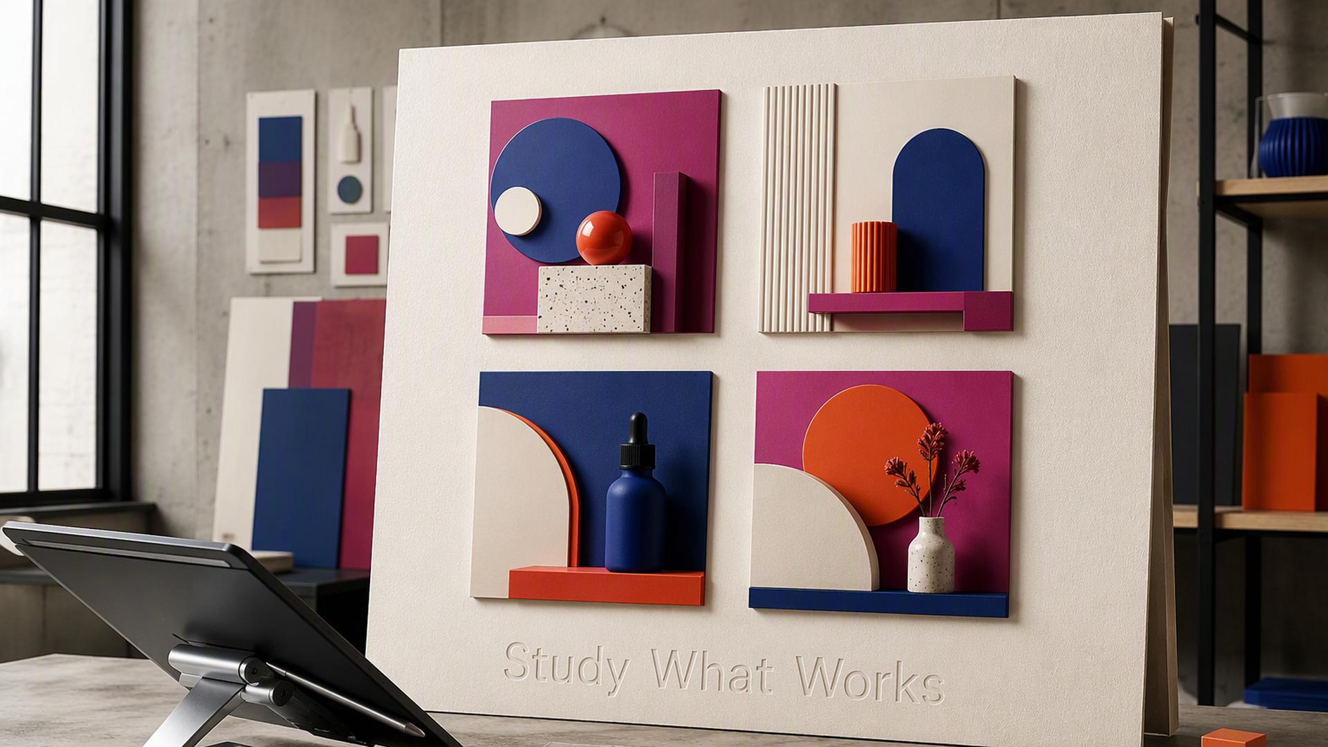
What Design Students Can Learn From Top-Performing Instagram Ads
Instagram ads are a small, fast design problem. A designer has a fraction of a second, a screen the size of a hand and an audience that did not ask to see the result. Studying the ads that survive in that environment is one of the quickest ways for a student to learn applied visual communication.
Why ads make good design study material
Ads are design under constraint. The brief is narrow, the audience is distracted and the result is measured by behavior. Students who analyze them learn to see hierarchy, rhythm and restraint, because anything unnecessary costs attention.
A practical place to start is a searchable library. Students can search the Instagram ad library offered by GetHookd, which says it indexes Instagram ads from businesses of all sizes, from local shops to multinationals, and lets users save ads to a personal swipe file where they are stored permanently. That permanence matters, since Instagram story ads vanish within a day and feed ads leave Meta's public library once a campaign is paused.
The free Meta Ad Library remains the primary public source for active ads, and it needs no account. Using both gives a student a free baseline and a way to build a lasting reference collection. Students can start with five saved ads.
Legibility is not optional
Text on an ad has to be readable at arm's length, in sunlight and by people with imperfect vision. The Web Content Accessibility Guidelines give a measurable standard. Success Criterion 1.4.3 calls for a contrast ratio of at least 4.5 to 1 for text and images of text, with 3 to 1 allowed for large text, defined as 18 point or 14 point bold.
The ratio is not arbitrary. W3C explains that 4.5 to 1 compensates for the loss of contrast sensitivity typical of people with vision equivalent to about 20/40, and that it accounts for moderately low acuity, color deficiencies and the effects of aging. Faint gray text over a busy photograph fails readers long before it fails a critic.
Students should test every ad they study. Run the headline and background through a contrast checker and note which top-performing ads pass comfortably and which fail. The exercise teaches that clarity is part of craft. It also builds a useful professional habit. Accessibility checks catch problems that look fine on a designer's bright monitor but fail on a dim phone, and clients increasingly expect to see that kind of diligence. A student who can explain why a headline passes or fails a contrast test has a stronger case in an interview than one who says only that the layout felt right.
The first second and the single message
Strong Instagram ads usually do one thing first. They show the product in use, pose a visible problem or present a face and a promise, and they do it before a thumb moves. Look at the first frame of each video and ask what the viewer would understand with the sound off.
Restraint appears again and again. One headline, one image idea and one call to action beat three competing messages. Space around the main element is not wasted, because it directs the eye to what matters.
Format knowledge counts as well. Vertical placements such as Stories and Reels leave areas at the top and bottom covered by interface elements, so key text belongs inside a safe zone. Students who learn those placements early avoid the classic error of a headline hidden under a profile icon. Test layouts on a real phone before calling them finished. Check them in bright light and with the volume off.
Reading what you cannot see
Public ad libraries do not reveal results. A design student looking at a saved ad does not know its conversion rate, so statements about top performance are inferences. The best available proxies are run length, the number of variations and whether a brand keeps returning to a style.
State inferences honestly in class projects. An ad that has run for months across several placements deserves attention, but a student should write that it appears durable rather than that it is the best performing.
Try to explain why a design might work. Is the contrast between product and background strong? Does the layout guide the eye in a clear path? Does the copy name a specific benefit? Hypotheses like these are what design critique is made of. Writing the hypothesis down before checking for evidence keeps the analysis honest and shows how much of design judgment rests on guessing. Revisit the guess after a few weeks.
Turning study into practice
Study becomes skill when it leads to making. Pick three ads in a category, extract what they share and design an original ad for an imaginary client that applies those principles without borrowing any layout or image. Then redesign it with a different hook and compare them.
Keep a record of the process. A portfolio that shows research, a brief, iterations and the reasoning behind each choice impresses employers more than finished images alone.
Respect the work being studied. Copying an existing ad closely is poor craft and carries legal risk, and the goal of the exercise is to build your own eye.
Share work for critique early. A classmate can tell you in seconds whether the first frame communicates, and watching someone else read your layout reveals problems that long staring hides. Over a semester, a habit of studying, making and testing in small cycles builds a portfolio and a vocabulary at the same time.